Inserting a Cartesian Graph
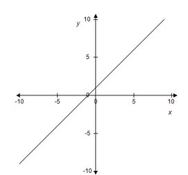
A Cartesian graph is a graph on a two-dimensional plane with a horizontal (x) and a vertical (y) axis. Points are represented by an ordered pair (x, y), where x is the horizontal distance from a point to the origin and y is the vertical distance from a point to the origin. Below is an example of the graph for y = x +1.
To insert a Cartesian graph:
-
Position the cursor at the location where you want to insert the Cartesian graph.
-
On the Insert menu, click Graph and then click Insert Cartesian Graph. The Cartesian Graph dialog box opens.
-
Enter the Width of the graph in inches.
Note: The maximum width is 8 inches. The value can include decimals. -
Enter the Height of the graph in inches.
Note: The maximum height is 8 inches. The value can include decimals. -
Enter the Title for the X-Axis and Y-Axis.
Note: You can format the text using HTML text. -
By default, the axis titles are top-aligned (y-axis), right-aligned (x-axis), and italicized. You can use the Center Title and Italicize Title check boxes change these defaults.
-
Enter the starting and ending points for the x- and y-axes in the corresponding Begin and End fields.
-
Select a Color for the x-axis and y-axis.
-
Select a color from the Grid Line Color list to display grid lines.
-
For each axis, enter a value in the Interval to set the scale between major tick marks. If you do not specify an Interval, the system will select an interval.
Note: The maximum number of major tick marks is 50 along the entire length of the axis. For example, suppose the range of the x-axis is -50 to 50 (a span of 100 units). If you set the Interval to 2 (i.e., ticks at 2, 4, 6, etc.), the axis will have 25 major ticks in both the positive and negative part of the axis, for a total of 50 major ticks (100/2). If you set the Interval to 1 (i.e., ticks at 1, 2, 3, etc.), you will not see any additional major ticks because that interval would produce 100 ticks (100/1). -
Enter the number of tick marks to display between the major tick marks in the Minor Tick Count.
Note: The maximum number of minor ticks is 100 along the entire length of the axis. For example, if you have an axis that runs from 0 to 20, you could enter up to 5 in the Minor Tick Count field (20 x 5). -
By default, each axis shows the axis lines, end arrows, tick marks, and tick-mark labels. You can choose to show or hide these using the Show Line, Show Arrows, Show Major Tick Marks, and Show Labels check boxes.
-
Click Add to add a layer to the graph. You can any of the following as a layer:
Circle
Ellipse
f(x)
f(y)
Hyperbola
Intersection
Normal Curve
Parabola
Parametric
Point
Polynomial
Segment
Shape
Text -
Use the Up and Down buttons to control the arrangement of the layers.
-
To make a copy of an existing layer, select the layer and then click Duplicate.
-
Click OK to insert the graph.